Refreshed and Responsive
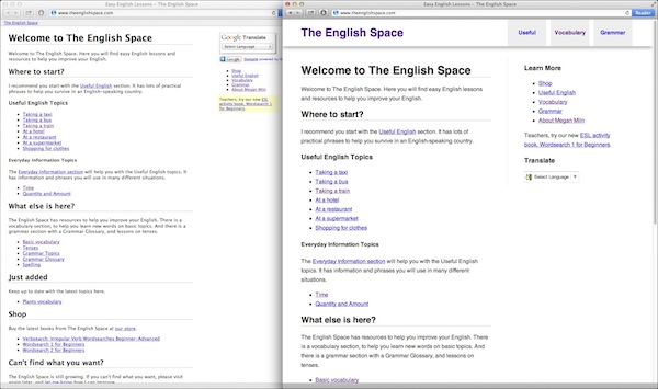
It has been on my to-do list for a while now. The English Space traffic has been growing steadily over the years and its design was starting to feel aged. So this weekend we rolled out a new look and feel for the site.
I have always appreciated The English Space’s clean and clear feel. The lack of animated images, bright colours, and stock photography make it stand out from the horde of other English language sites. I was keen to preserve this hallmark.
The new site is based on the HTML5 Boilerplate and Initializr projects. This is the first time I have used this approach and it worked really well.

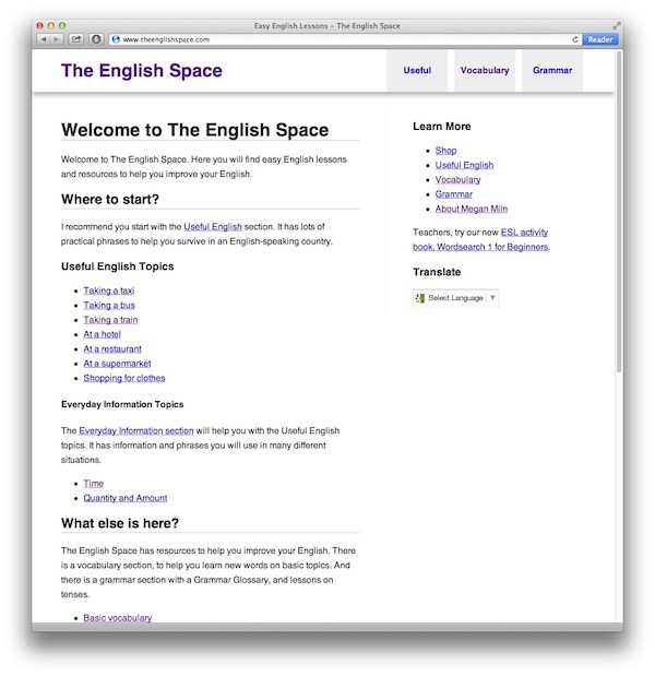
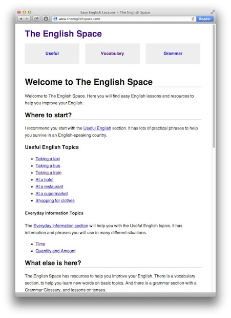
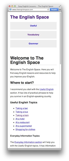
The English Space is now responsive. This term is being used by web designers to mean a web site that adapts to the size of the viewer’s screen. Viewing the site on a desktop computer allows for bigger elements and more white space, when compared to viewing the site on a mobile phone. You always see the same content but the content is actively tailored to your screen size. You can see this effect in action by resizing your browser window while viewing The English Space on a desktop computer.


I put a little effort into making sure printed pages from The English Space also look good. The stylesheet controlling the printing removes the header and sidebar to ensure the printed page is useful and not too cluttered. I am not sure about the inclusion of URLs within the body of the text. For now they will stay.
The English Space is a fun project. Megan writes the content in a wiki-like format. From there I have built a tool to go from this collection of reasonably readable plain text files all the way through to a static web site ready to be published.